
A common question in redesign projects is: How do we create a homepage that helps customers quickly understand what we offer and what they should do next? The answer rarely lies in a larger hero section, more animation or a button in a brighter shade of pink. Above all, the homepage needs to function as a guide.
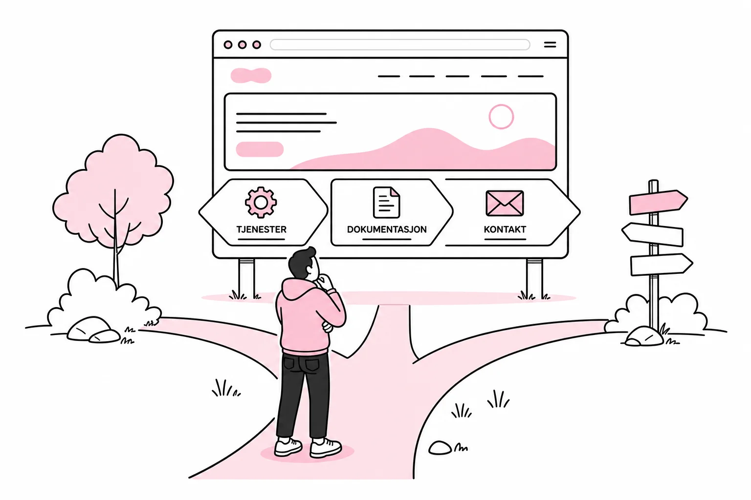
Many business homepages try to tell the company’s entire story at once. The result is a bit like mounting an annual report on a road sign: an impressive amount of information, but limited help at the next junction. A good homepage instead prioritises a few key tasks and guides different visitors to the right content.
Start with the task the homepage needs to solve
Before discussing colours, fonts and imagery, define which questions a new visitor needs answered. For most business websites, they are fairly straightforward:
- What do you offer?
- Who is the offering relevant to?
- What problem do you solve?
- Why should the customer consider you specifically?
- What is a natural next step?
This does not mean forcing every answer into the first screen. The hero section should establish direction, not hold a complete sales meeting. A clear heading, a brief explanation and one prioritised action are often enough to move the right user forward.
Formulate the heading around the customer’s needs. “We create the holistic solutions of the future” says little about the product, target audience or value. “Accounting software for Norwegian trade businesses”, on the other hand, gives the user something concrete to consider. Creativity can continue elsewhere, but it does not need to stand guard at reception.
Create a simple content hierarchy
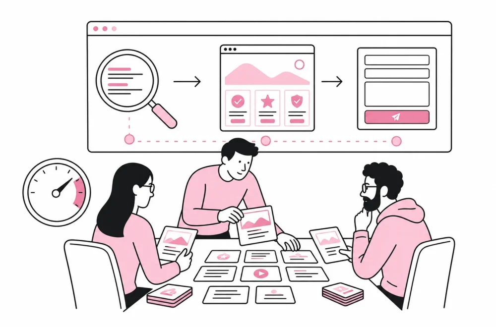
A useful homepage can be structured as a sequence of decisions. Start with the offering and target audience. Then show the most important services or entry points. Follow up with evidence such as customer stories, working methods, expertise or specific deliverables. End with a next step that fits the buying process.
- Orientation: What does the business offer, and to whom?
- Choice: Which service, solution or situation applies?
- Confidence: What demonstrates that the business can deliver?
- Action: What should the user do now?
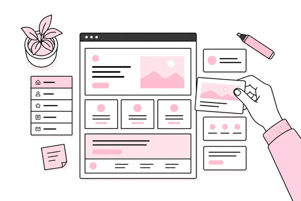
This structure can be sketched as a simple grey wireframe before anyone designs the details. If the content does not make sense in black boxes on a white background, gradients and floating geometric shapes rarely make it clearer.
Turn navigation into a decision tool
The main menu should help users recognise their own task. Menu items such as “Services”, “Products”, “Industries” and “About us” can work well when the content beneath them is clearly organised. The problem arises when internal departments, product names and historical initiatives each get their own place because no one wants to tidy up.
An overcrowded mega menu soon resembles a shed where every cable since 2009 has been kept. There is probably something useful at the back, but few people want to start the excavation. Therefore, limit the top level to the most important entry points, and use descriptive subpages for the rest.
Menu labels should use words customers understand without internal training. If the business calls its consultancy service “Strategic Acceleration”, while customers search for “IT Consulting”, the customer’s term should normally win. Visual identity can handle an understandable noun.
Connect the menu to the homepage content
The homepage and navigation should use the same logic. If the menu divides the offering by industry, while the homepage divides it by product and the sales team divides it by region, users have to translate the organisation chart as they go. Choose one primary model and use it consistently.
For a business with three clearly defined services, for example, the homepage could show three equally prominent cards with the service name, a brief value description and a link to learn more. If you have many products, it may be better to start with the customer’s situation: “I’m setting up”, “I want to improve efficiency” or “I need help with operations”. The right model depends on how customers actually find their way around, not on which card component looks best in the design mock-up.
Let typography and visual identity do practical work
Typography creates both personality and readability. Choose typefaces that work with Norwegian characters, small sizes and different screen widths. Body text should have clear contrast, generous line spacing and a line length that makes it easy to find the next line. Headings must clearly distinguish levels, not merely vary between “large”, “slightly less large” and “the same size, but now in pink”.
Two well-chosen typefaces are often more than enough. A broad selection of fonts, weights and decorative variants quickly becomes typographic tapas: lots to sample, but difficult to understand what the main course actually is. Define consistent styles for headings, body text, introductions, links, buttons and helper text, and use them consistently.
The visual identity should support the content hierarchy. Colour can highlight actions and categories, but must not be the only signal. Icons can aid recognition, but should be combined with text when their meaning is not obvious. Images should explain the business, product or situation—not merely fill a pretty rectangle between two sections.
Build accessibility into the design system
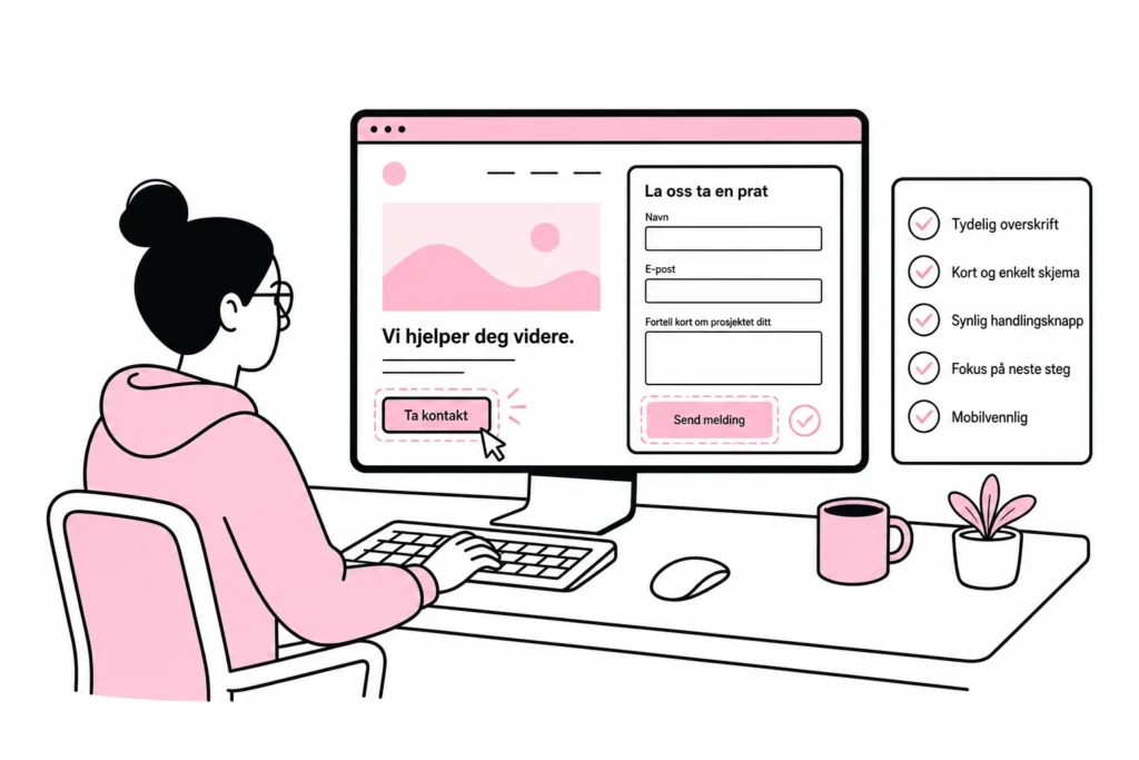
Accessibility becomes easier when it is treated as part of the components, not as a compliance task just before launch. Buttons need clear states for focus, hover and activation. Links must be recognisable. Form labels should be visible and understandable. Text and interactive elements must have sufficient contrast, and the content should work when the text is enlarged or the window becomes narrow.
An add-on that promises to “fix accessibility” with one button cannot repair weak structure, unclear copy or incorrectly built components. It is rather like drawing an umbrella on the floor plan and declaring the roof finished. Instead, test the core components with a keyboard, screen magnification and relevant assistive technologies before copying them across fifty pages.
- Can all actions be reached and used with a keyboard?
- Is the focus indicator easy to see?
- Do the headings follow a logical order?
- Are the link texts understandable without the surrounding paragraph?
- Does the page retain its meaning without colour and decorative images?
- Does the content work when zoomed in and on narrow screens?
Design conversion as a natural next step
Conversion is not about placing as many buttons as possible on the page. It is about offering the right action when the user has enough information to take it. For a simple service, “Book a site visit” may be a natural early option. For a complex investment, “See how we work” or “Read a customer story” may be a better intermediate step before making contact.
Choose one primary action per section, and give secondary options less visual emphasis. When “Contact us”, “Book a meeting”, “Get a quote”, “Download”, “Watch video” and “Sign up” are all shouting at once, you do not have six conversion opportunities. You have a small digital all-hands meeting without a facilitator.
Button labels should describe the outcome of the action. “Send enquiry”, “View our services” and “Request a quote” are clearer than “Click here” and “Read more”. Also explain what happens next. A short message such as “We normally reply with suggestions for the next step” reduces uncertainty without requiring a separate automation universe with three plugins and a consultant-certified funnel.
Measure whether the design actually helps
Before launch, define a few indicators that the homepage is working. These might include how many people continue to priority service pages, start a relevant form or find the contact information. Also look for unsuccessful patterns: repeated returns to the menu, heavy traffic to irrelevant pages or forms that are started but not completed.
Combine measurement with short user tests. Ask people in the target audience to explain what the company offers, find a specific service and show what they would do next. Do not help them along the way. The silence that arises when a test participant is looking for a menu item is often more informative than a long workshop on “digital brand experience”.
A good homepage does not need to be spectacular. It needs a clear purpose, an understandable hierarchy, consistent navigation, readable typography, accessible components and actions that fit the user’s decision. When these elements work together, the design becomes less concerned with showing off – and far better at moving the customer forward.