
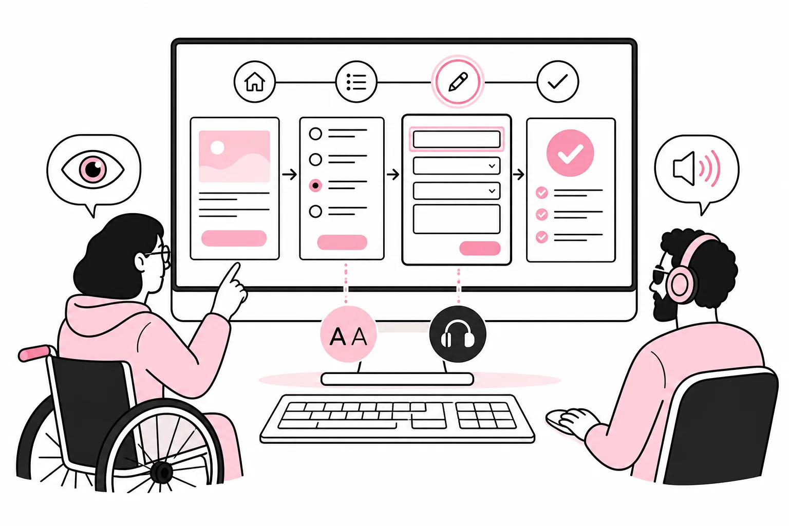
How do you find out whether a website is genuinely accessible – and not merely accompanied by a report where most of the lights are green? Start with one critical user journey and test it from start to finish. This could involve finding a product, booking an appointment, applying for a job or submitting an enquiry.
This method is more useful than starting with a random list of WCAG criteria. The criteria are necessary, but users do not experience a website one criterion at a time. They experience a connected task in which one inaccessible field, one focus trap or one incomprehensible error message can bring the entire journey to a halt.
An accessibility tool that places a button on top of the website does not solve the underlying problems either. It is rather like installing a doorbell on a staircase and declaring the entrance step-free. Test what has actually been built instead.
Choose the journey that matters most
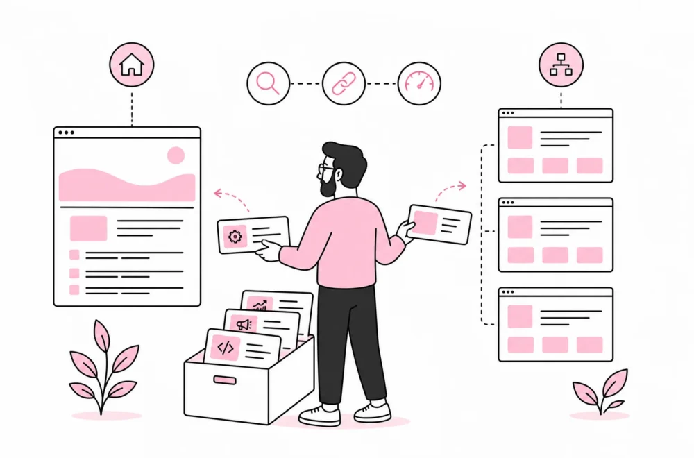
First, choose a task that is important to both the user and the organisation. The journey should have a clear start and end, for example from the landing page to a confirmed submission. Include all intermediate steps: navigation, search, dialogue boxes, login, form and confirmation.
Describe the journey using concrete actions, not internal page names. “The user finds the service, understands the terms, completes the form and receives confirmation” is more useful than “test service page 4B”. The former reveals the context. The latter sounds mostly like a folder no one dares to delete.
Such a review is not the same as a full WCAG audit. It does, however, provide a good picture of the most serious barriers in an important task. A full conformance assessment must cover relevant page types, components, content and WCAG requirements. Which legal requirements apply also depends on the organisation and should be verified against current regulations.
Clarify this before the test
- Goal: What should the user be able to complete?
- Starting point: Does the user arrive from the homepage, a search or a campaign?
- End point: What indicates that the task is complete?
- Variants: Are there validation errors, empty search results or alternative options?
- Test environment: Use realistic content and the same components that will be published.
Test in five layers – in the right order
Start with automated tests, but do not stop there. Such tools are good at finding certain code errors, such as missing alternative text, some contrast violations and invalid ARIA attributes. They cannot determine whether alternative text is useful, whether the focus order is logical or whether the instructions actually make sense.
A green result therefore means “no machine-detectable errors in what was checked”, not “everyone can use the solution”. An automated test is a smoke detector, not a complete fire brigade.
1. Structure and content
Read the page without relying on the design for support. Does the page have one clear main heading? Do the subheadings follow an understandable structure? Do the link texts describe their destination, or does the page consist of a collection of “read more” links that become meaningless without the visual context?
Also check that images have the correct alternative text. Informative images need a brief description of relevant content or function. Decorative images should be ignored by assistive technologies. An image of a chart needs more than “chart”; that is technically correct in much the same way as describing an accounts statement as “numbers”.
2. Keyboard and visible focus
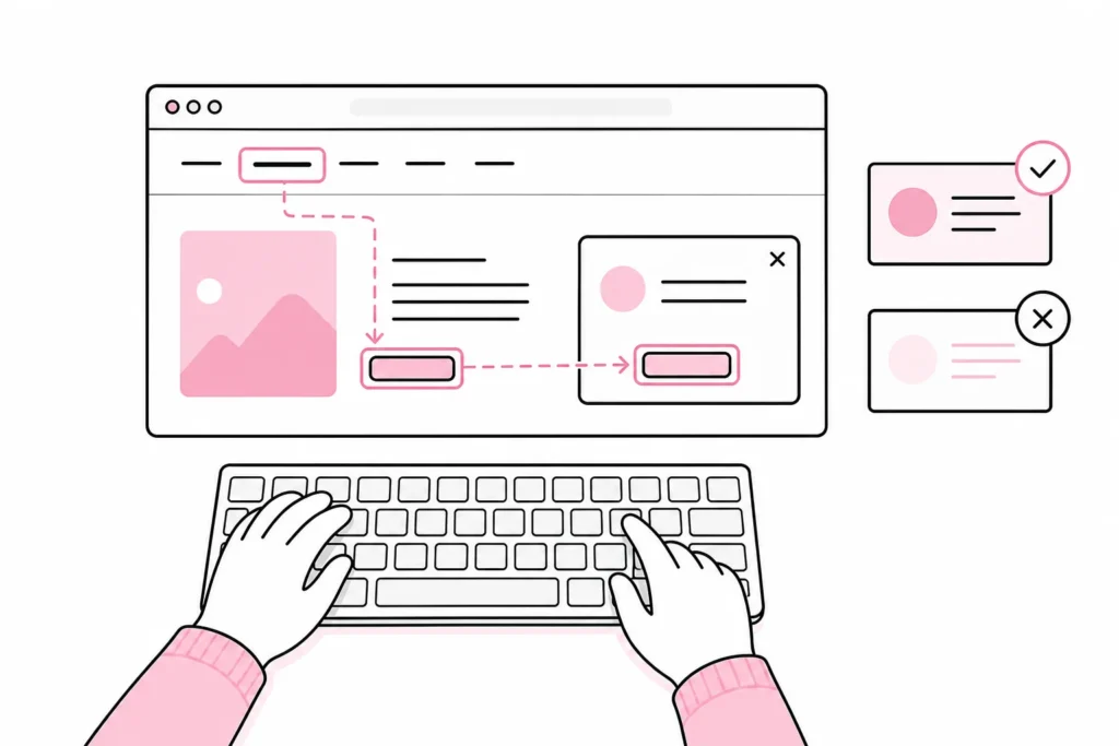
Put the mouse aside. Use Tab and Shift+Tab to move around, Enter and Space to activate elements, arrow keys where appropriate for the component type, and Escape to close dialogues or menus. All interactive elements must be reachable and usable, and the focus order must follow the task logically.
The focus indicator should be clearly visible against both light and dark surfaces. It must not be clipped or hidden behind sticky headers. Removing the focus indicator because it “interferes with the look” is a classic from design school, where the user should preferably leave no trace.
Pay particular attention to menus, tabs, carousels, dropdown fields and dialogue boxes. A dialogue should move focus inside when it opens, keep keyboard focus on relevant elements while it is active, and return focus to a sensible place when it closes. The user should never become stuck.
3. Contrast, zoom and visual understanding
WCAG Level AA normally requires a contrast ratio of at least 4.5:1 for regular text and 3:1 for large text. Important graphical objects and states in user interfaces also have contrast requirements. Measure actual colour combinations; screen brightness and a designer’s well-trained intuition are imprecise instruments.
Do not use colour as the only signal. A red field is not necessarily understandable to a user who cannot perceive the colour, nor to a screen reader. Combine colour with text, an icon or another clear indicator. Also test the page at high zoom and in a narrow window. Content and functionality should not disappear, overlap or require unnecessary horizontal scrolling.
4. Screen reader and programmatic information
Go through the journey with a screen reader that matches the operating system and browser you are testing in. Listen to headings, links, buttons, field labels, states and error messages. The goal is not for the page to sound identical in every assistive technology, but for its name, role, value and state to be conveyed correctly.
Pay particular attention to components that change without a new page loading. If a product is added to the basket, a search is updated or a form is saved, the relevant status must be perceivable. Otherwise, the interface has performed a little magic trick: the system knows what happened, while the user is left to guess.
It is useful to test the heading list and landmarks first. They function as a table of contents and road signs. A mega menu with a hundred links before the main content may technically be read aloud, but it is a fairly thorough way of saying “welcome”.
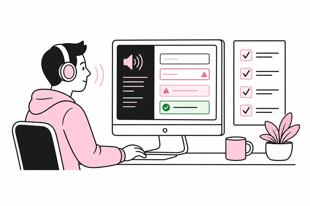
5. Forms and errors
All fields must have visible labels that are also programmatically associated with the correct field. Placeholder text is a supplement, not a label; it disappears when the user types and often has poor contrast. Instructions should appear before they are needed, especially when fields require a specific format.
Intentionally trigger errors. The message must explain which field contains an error, what the problem is and how it can be corrected. The error must be associated with the field so that a screen reader can perceive it. On submission, focus should move to a clear error summary or the first relevant error, depending on the structure of the form.
Keep information the user has already entered. A form that clears all fields after one error turns validation into an endurance sport nobody asked for. Confirmation after a successful submission must also be clear and accessible, not merely a brief green flash.
Link findings to WCAG and user impact
Record each finding with the page, component, test step, expected behaviour and actual result. Include a brief description of how the error affects the user. Then link the finding to the relevant WCAG success criterion. This gives developers something concrete to fix, while the organisation gains traceability against the requirements.
Prioritize obstacles that block the task first: elements that cannot be reached with a keyboard, missing field labels, inaccessible dialogs, unreadable text, or errors that are not communicated. Then address problems that make the journey unnecessarily difficult, followed by minor deviations and improvements.
- Critical: The task cannot be completed by some users.
- Serious: The task can be completed, but with significant extra effort or uncertainty.
- Moderate: The solution is understandable, but has a clear accessibility issue.
- Improvement: Not necessarily a violation, but the solution could be simpler and more inclusive.
Make testing part of the delivery
The greatest benefit comes when the test is repeated after changes. Include the critical user journey in the acceptance criteria for design, development, and publication. Automate the checks that can be automated, and retain manual checkpoints for keyboard, screen reader, zoom, content, and error handling.
Distribute responsibility. Designers must specify contrast, focus, and states. Developers must build semantics and keyboard behavior. Editors must write clear headings, links, and alternative text. Testers must check the entire journey. Accessibility works poorly as a ceremonial folder sent to “someone technical” two days before launch.
When one important user journey works with a keyboard, high zoom, a screen reader, and clear forms, you have solved something concrete. Then test the next journey and expand the coverage. It is less spectacular than a magical accessibility plugin, but it works.